
Back
The Ridge
Creative Direction, Branding, Trail Building
The Ridge is a dedicated trailhead and cycling destination in Lexington, North Carolina. Designed to attract both mountain bikers and road cyclists, the hub offers access to an integrated trail system as well as scenic country roads. The site serves as a centralized point for riders to start, explore, and connect—positioning Lexington as a regional cycling tourism hotspot.
The Challenge
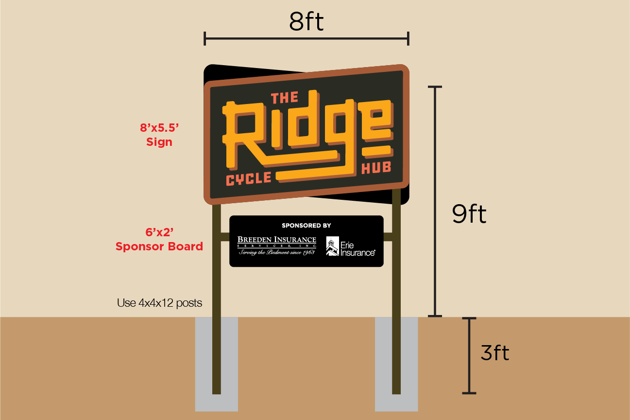
The local cycling club, Roadies and Dirties, needed a cohesive brand identity and signage system for their most ambitious project to date. The branding extended across multiple touchpoints, including trailhead wayfinding, roadside signage, and a custom-designed storage container that featured trail maps and sponsor recognition. The goal was to create a unified visual presence that enhanced the rider experience and elevated community visibility.
The Solution
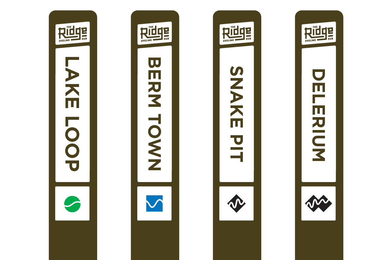
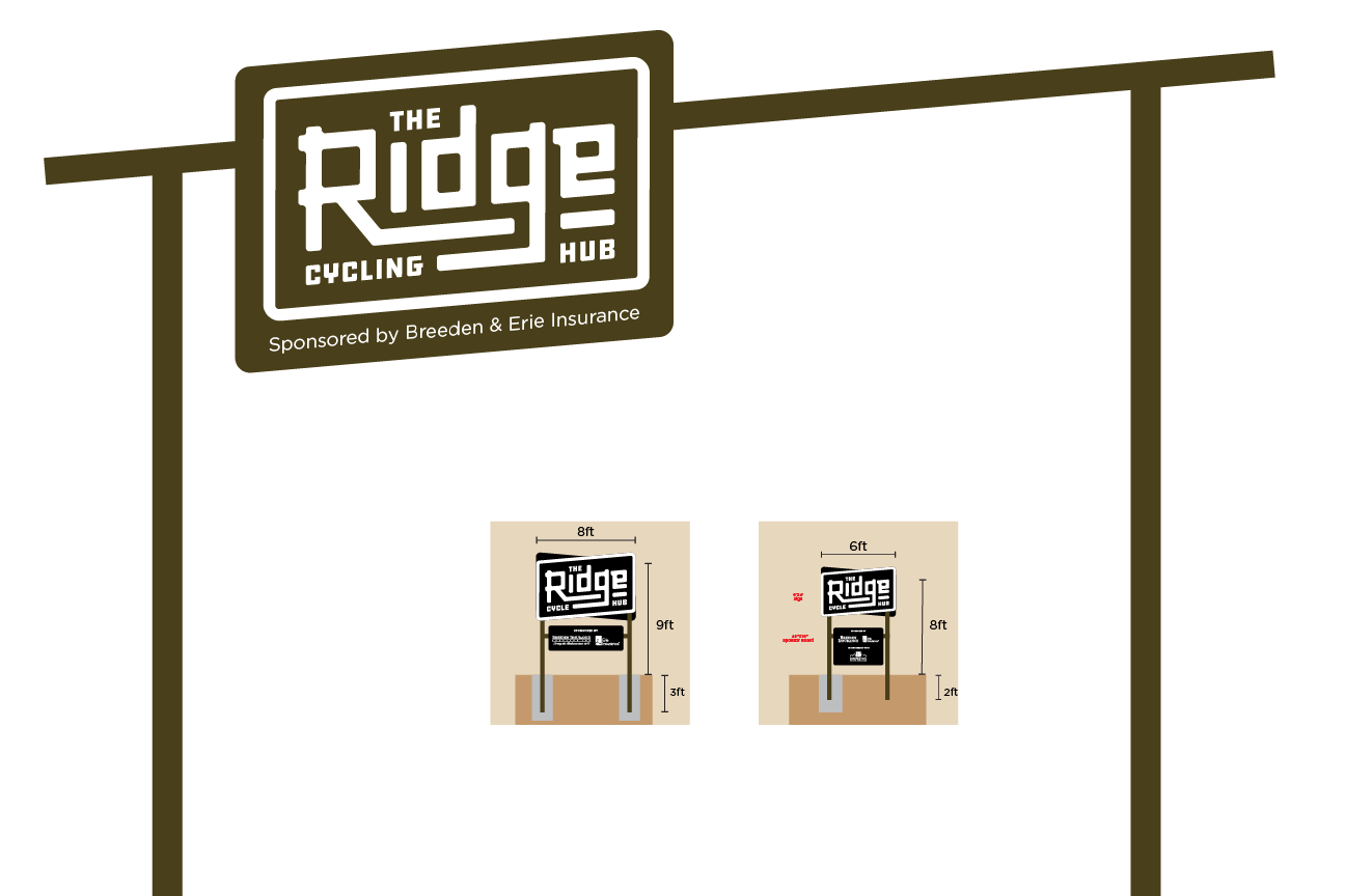
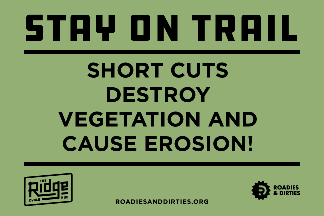
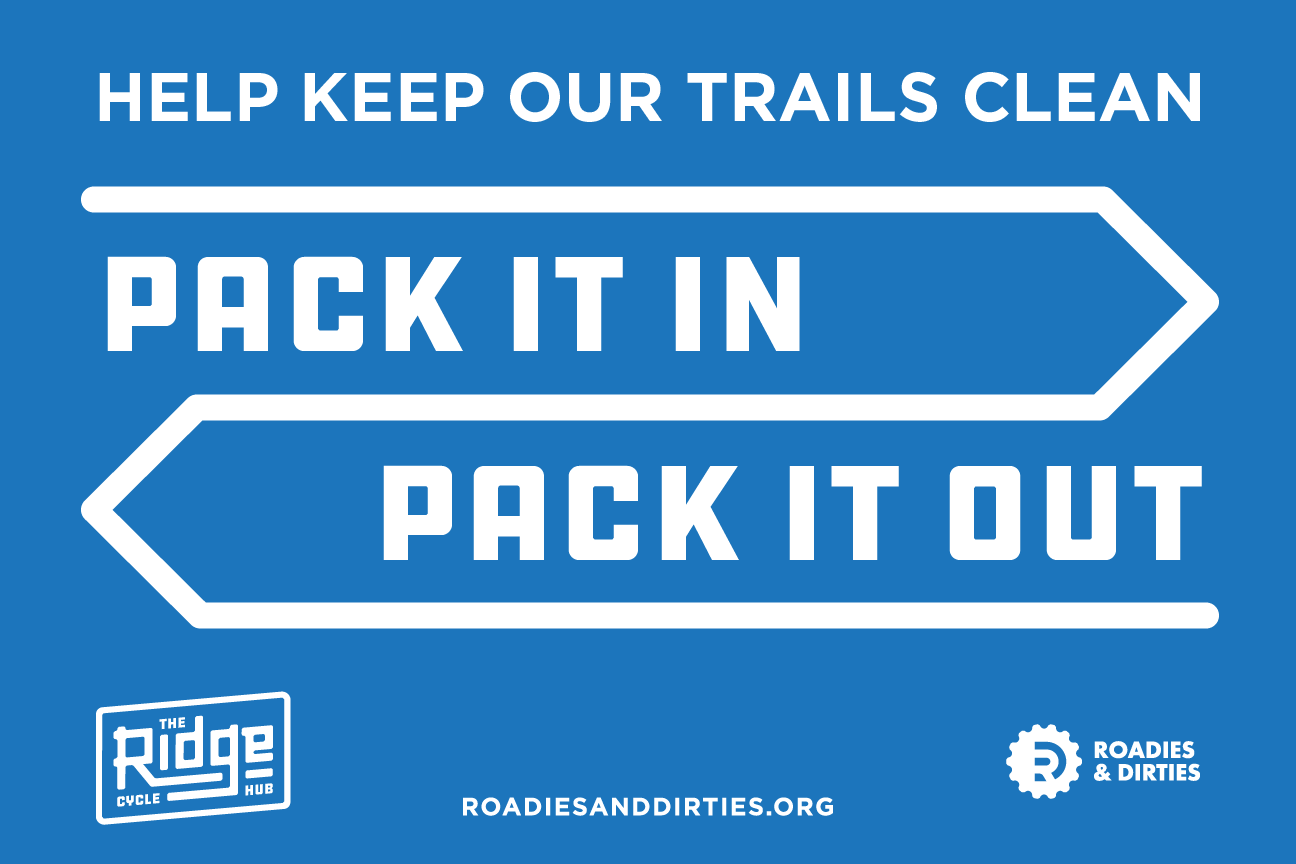
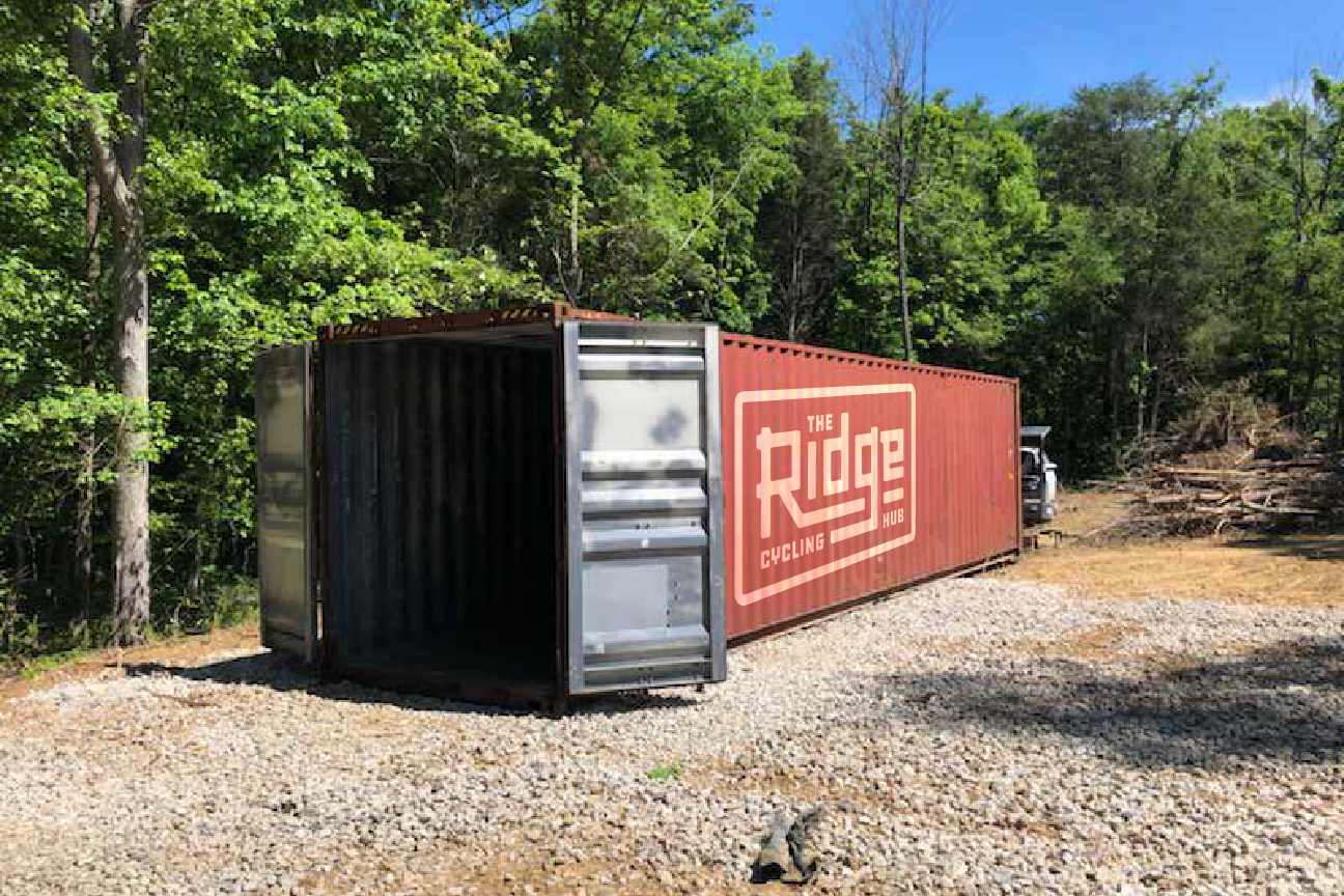
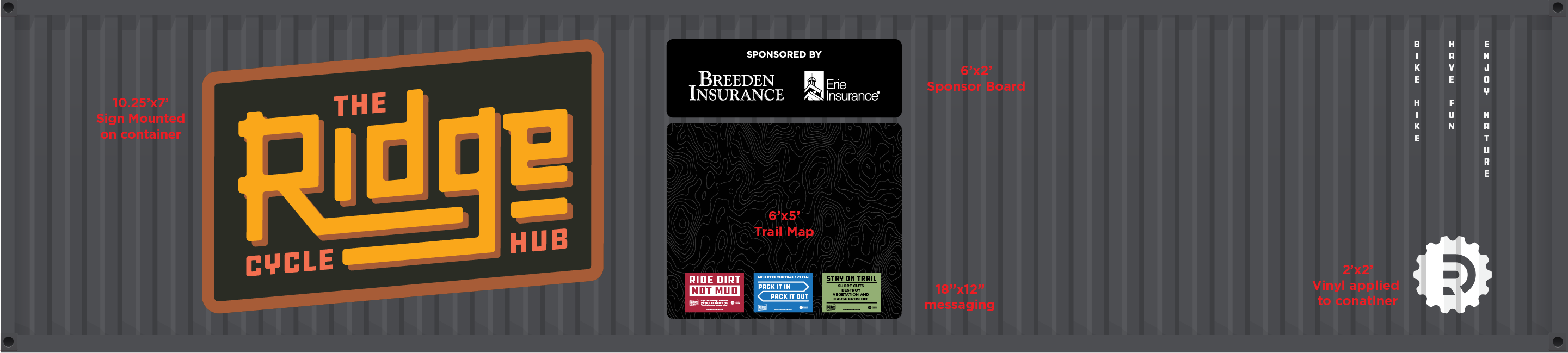
I developed a cohesive visual identity for Roadies and Dirties that reflected the club’s adventurous and inclusive spirit. The branding included a custom logo, color palette, and typography system, all applied consistently across trail signage, roadside banners, and a large format graphic wrap for the on-site storage container. The storage unit served as both a functional hub and a brand billboard—featuring trail maps, sponsor recognition, and club information. The signage system enhanced navigation, reinforced brand presence, and created a professional, welcoming experience for visiting cyclists.
Proposed storage container layout
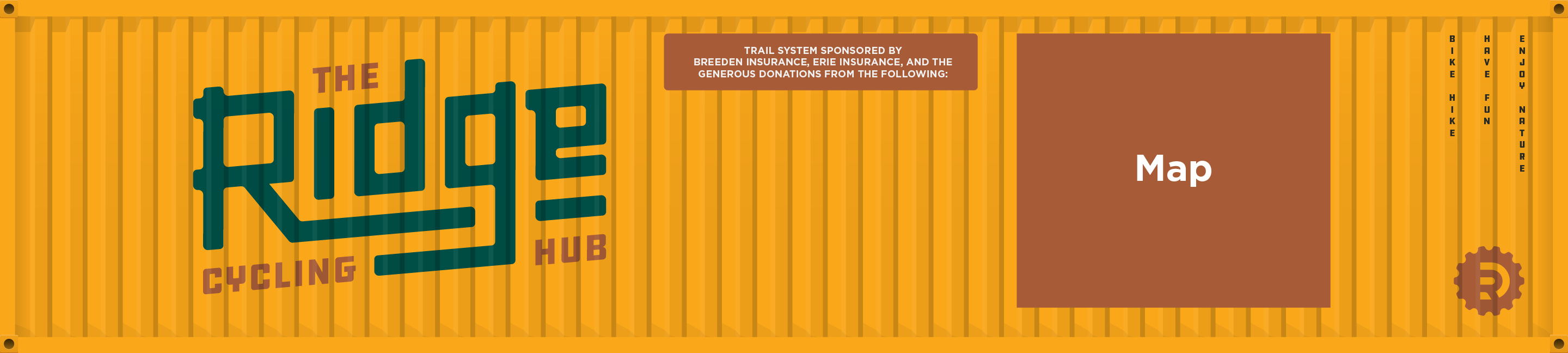
Final storage container layout
Back
The Ridge
Creative Direction, Branding, Trail Building
The Ridge is a dedicated trailhead and cycling destination in Lexington, North Carolina. Designed to attract both mountain bikers and road cyclists, the hub offers access to an integrated trail system as well as scenic country roads. The site serves as a centralized point for riders to start, explore, and connect—positioning Lexington as a regional cycling tourism hotspot.
The Challenge
The local cycling club, Roadies and Dirties, needed a cohesive brand identity and signage system for their most ambitious project to date. The branding extended across multiple touchpoints, including trailhead wayfinding, roadside signage, and a custom-designed storage container that featured trail maps and sponsor recognition. The goal was to create a unified visual presence that enhanced the rider experience and elevated community visibility.
The Solution
I developed a cohesive visual identity for Roadies and Dirties that reflected the club’s adventurous and inclusive spirit. The branding included a custom logo, color palette, and typography system, all applied consistently across trail signage, roadside banners, and a large format graphic wrap for the on-site storage container. The storage unit served as both a functional hub and a brand billboard—featuring trail maps, sponsor recognition, and club information. The signage system enhanced navigation, reinforced brand presence, and created a professional, welcoming experience for visiting cyclists.
Proposed storage container layout
Final storage container layout